
GRAIA: Growth Through AI Empathy
Brand Strategy and Visual Identity of the GRAIA Platform
Brand strategy, communication guidelines and visual Identity

Meritus ulaganja is one of the fastest-growing companies in the region, with over 14,000 employees. Although they are extremely proud of their long-standing tradition, they decided it was necessary to refresh the brand, so they engaged the agency Bruketa&Žinić&Grey to assist them. The process resulted in the creation of a new, fresh, and dynamic brand – Bosqar In.
Bosqar In. is an indigenous brand equipped with knowledge, energy, and experience, and it has long outgrown local or even regional boundaries. Its bullish character will take it much further.

Analysis
The rebranding process began with a thorough analysis of the current image, market conditions, and competition. Through a series of workshops and interviews with key individuals within the company, the agency managed to delve into the very core of the business, which was important for understanding their values, vision, and ambition. The analysis revealed key brand attributes: expertise, reliability, energy, and commitment to growth. Based on these attributes, a foundation was formed for the further development of the brand.


Synthesis
Based on the information obtained from the analysis, a new brand strategy was created with a clearly defined purpose—”creating a lasting impact.” Archetypes were chosen that best reflect the brand’s personality: the Magician (power, transformation), the Ruler (control, structure), and the Caregiver (care, support). These archetypes perfectly embody the key values of Bosqar In.: competent engagement, supporting growth, and an entrepreneurial mindset. Each of these synthesis elements was carefully selected to create a brand that reflects the company’s strength, stability, and innovation.


Implementation
The synthesis came to life through the new name – Bosqar In. The name reflects strength and stability, combining associations with the Latin word “boscus” (forest, growth) and “boškarin” (a strong, indigenous bull). The visual identity follows the same guiding principle, using elegant typography, a golden color (wealth, wisdom) and a subtle illustration of stylized boškarin horns. The new brand Bosqar In. represents the evolution of the company – reflecting its strength, expertise, and commitment to creating lasting value for its clients and partners. This transformation is not just a name change but a complete redefinition of how the company presents itself to the world.


Brand Strategy and Visual Identity of the GRAIA Platform
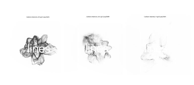
Visual identity for LINES – the Laboratory for Intelligent Energy Systems at the Faculty of Mechanical Engineering and Naval Architecture, University of Zagreb
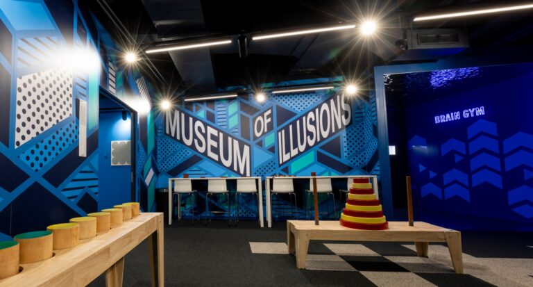
Designing a graphic system for the global Museum of Illusions brand