Brand repositioning and visual identity redesign of the Koykan restaurant chain
For a long time, Koykan has been a place where you can travel the world with every bite. For this very reason, their new slogan says stay hungry – hungry for adventure, new experiences, expanding horizons, hungry for life.
Analysis
Global trends show a tendency for a growing interest in quality foods. Given their fast-paced lifestyle, people need a place where they can quickly get a high quality meal. They appreciate the companies that care for the environment, recycle and use renewable energy sources. According to the EU statistics, the limited-service restaurant segment with no table service is predicted to have continuous growth.
The Koykan’s visual identity analysis indicated a weakness caused by the prevailing green color featured in the restaurant’s visual identity because a huge number of people automatically perceive it to be a vegan only restaurant, without even bothering to find out more about the restaurant’s offer.
Synthesis
Koykan wants to spur people to explore the world by tasting the flavors of diverse cultures. The restaurant guarantees it will never compromise its core values and make concessions in terms of freshness, quality, taste, health, speed and affordability.
The brand’s role is to facilitate exploration of the world by tasting new dishes which also allow exploration of new cultures. Life is full of colors, flavors, diversity and experiences, and almost no one wants to have limited choices, particularly when it comes to food.
Koykan’s dishes are selected taking into account people’s demands and desires, and the restaurant’s diversity of choices allows everyone to find something for themselves.
The brand’s essence can best be described by imagining a group of adventurers travelling the world picking only the best souvenirs in the likes of food and bringing them home for others to enjoy.
Implementation
Although people come to Koykan to eat, the slogan says “Stay hungry for more”. Stay hungry for adventures, new experiences, expanding horizons, hungry for life.
The visual identity stems from three motifs: natural, sustainable and earthy. The earthy motif in this case is an allusion to food from different parts of the world. The logo has been adapted to the new concept to dissociate it from the green color that may lead to the misconception about vegan only food. However, the little leaf motif was preserved to be associated with fresh, healthy, natural and tasty. The new, soft brand color contributes to feeling at ease.
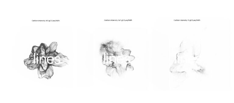
Visual identity for LINES – the Laboratory for Intelligent Energy Systems at the Faculty of Mechanical Engineering and Naval Architecture, University of Zagreb
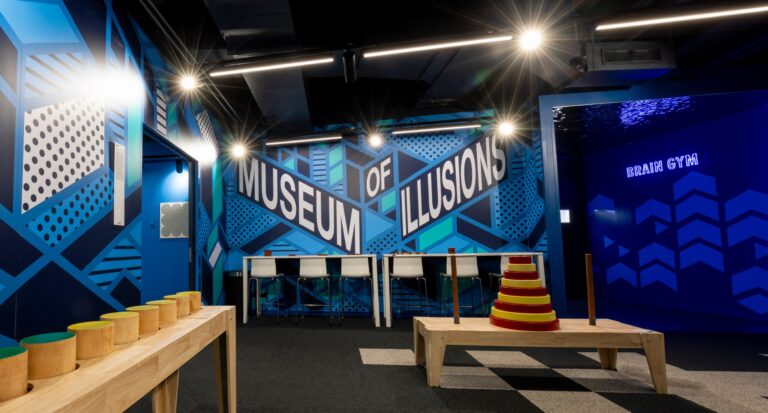
Designing a graphic system for the global Museum of Illusions brand
Subscribe to our newsletter
Receive email updates with a selection of articles published on our website, including some of our latest projects, job vacancies, events and other agency related news.