Indeloop: A visual identity that has made a full circle
Indeloop – a company with a new energy
Indeloop uses waste to produce hydrogen (H2) – fuel for the vehicles of the future. The name IndeLoop was coined from two words: independent and loop, directly conveying the company’s chief mission. Drawing largely on hydrogen and its properties, the logotype is composed of overlapping circles, which in effect produce the letters I and L.
Indeloop / Vjekoslav Majetić (DOK-ING&Indeloop Founder), Ana Pešić (DOK-ING Member of the Supervisory Board), Danica Maljković (Indeloop CEO), Nađa Dizdarević (Indeloop Head of Business Development)
MPR / Božo Skoko, PhD (Member of the Board and Partner), Marko Ćustić (Senior Consultant)
Bruketa&Žinić&Grey / Davor Bruketa and Vanja Činić (Creative Directors), Roberta Kranjec and Zrinka Jugec (Account Directors), Ivan Golubić (Senior Copywriter), Ivor Borovečki (Junior Copywriter), Martina Tupek and Nikola Slamić (Copywriters), Iva Pemper (Senior Designer)
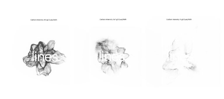
Visual identity for LINES – the Laboratory for Intelligent Energy Systems at the Faculty of Mechanical Engineering and Naval Architecture, University of Zagreb
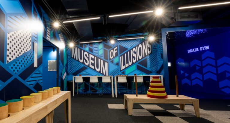
Designing a graphic system for the global Museum of Illusions brand
Subscribe to our newsletter
Receive email updates with a selection of articles published on our website, including some of our latest projects, job vacancies, events and other agency related news.