OmoLab is a start-up behind font and application products designed as reading facilitating tools for dyslexic people. The OmoLab team was awarded free branding in the call for proposals organized by Fortenova and Hanza Media. The Bruketa&Žinić&Grey Agency was tasked with its brand strategy formulation and visual identity redesign. Komunikacijski ured Colić, Laco i partneri (Communications Office Colić, Laco and Partners) also took part in the project, whose team was responsible for the communication strategy.
Brand strategy
The brand strategy includes the guidelines for long-term brand development and the overall brand experience with the environment. The OmoLab a.k.a. Omoguru strategy has come out of the challenges faced by the brand today and its vision for tomorrow.
VISION
– enter the US and global market
– become the first choice reading solution for dyslexic readers in any media
– create a community of communication-deprived people in collaboration with experts through research and support
– become an active participant in the creation of a more equitable society.
CHALLENGES
– target audience is not sufficiently aware of the Omoguru products (font and application) or of the activities and values advocated by the brand
– in general, the society shows rather poor knowledge of dyslexia, which leads to the prejudice linked to dyslexia
– the global market is competitive, and the expert community feels distrust in new solutions.
BRAND PURPOSE:
The creation of a society of equitable opportunities, without prejudice.
BRAND MANIFESTO:
The world we are creating is inclusive, i.e. not only does it tolerate diversities but it also accepts them. Such world, our world, supports a number of paths to achieve self-actualization, as this path is never universal, creating support for those who encounter obstacles in that path.
THE WAY IN WHICH WE ATTAIN IT:
By making the difficulty invisible, and the difference positive.
The new brand strategy has also proven the need for a new name, and after some joint brainstorming the decision was taken to rename the brand as Omoguru.
Visual identity
The visual identity contains the basic visual standards of the brand. It is essential to consistently comply with such standards for the sake of brand recognisability and its visual identity consistence with the underlying narrative.
The redesigned visual identity stems from the new brand strategy and the new name Omoguru derived from the exitsing ‘old’ name and the OmoLab logotype. It is comprised of the overarching icon and the logotype with the associated brand architecture (Omoguru type, Omoguru reader, Omoguru shop).
The primary icon, a lowercase letter g in guru, signifies a teacher, whereas the secondary icon, a lowercase letter o in omo denotes a disciple. All products / business segments use the same overarching icon that becomes animated once displayed on the screen (computer, cell phone) identifying a particular segment with a recognizable icon.
The eye is still the basic element of the visual language and the identity system, represented within a simple circle or expanded by ‘a body’. The visual identity redesign suggests a possibility of designing abstract or illustrative graphic compositions from the basic circle, using the colour palette of this brand.
The redesign has maintained the way in which the name of the logotype is written without spacing, but has eliminated the uppercase initials (OmoLab -> omoguru). The presentations of brand extensions have been changed to retain Omoguru at all times as a recognizable overarching brand with extension names as add-ons (Omoguru type, Omoguru reader, Omoguru shop) in place of the former “omo”-prefixed versions (OmoType, OmoReader).
Omoguru / Petar Reić (Founder), Vanja Andrić (Marketing and Sales Manager) Ratko Knežević (Investor), Maja Peretić (Speech Pathology Professor, Professional Associate)
Bruketa&Žinić&Grey / Nikola Žinić (Creative Director), Ivanka Mabić Gagić (Account Director), Josip Buzov (Junior Strategic Planner), Mirna Ptiček (Art Director), Sonja Martinović Domitrović (Account Manager), Petra Adžić (Account Executive)
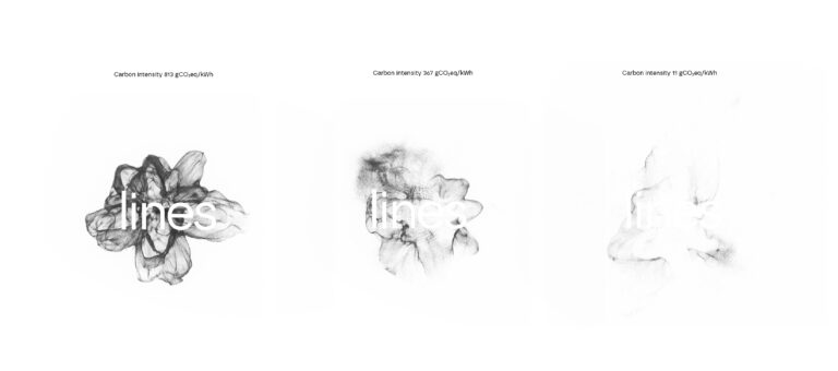
Visual identity for LINES – the Laboratory for Intelligent Energy Systems at the Faculty of Mechanical Engineering and Naval Architecture, University of Zagreb
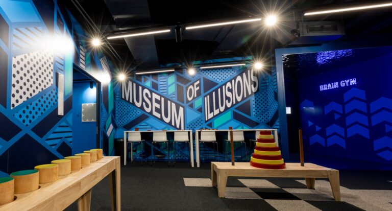
Designing a graphic system for the global Museum of Illusions brand
Subscribe to our newsletter
Receive email updates with a selection of articles published on our website, including some of our latest projects, job vacancies, events and other agency related news.